-
If you are citizen of an European Union member nation, you may not use this service unless you are at least 16 years old.
-
You already know Dokkio is an AI-powered assistant to organize & manage your digital files & messages. Very soon, Dokkio will support Outlook as well as One Drive. Check it out today!
| |
DatePickerCalendar
Page history
last edited
by Todd Parker 14 years, 11 months ago
type: widget
release: 0.0
priority: high || medium || low
status: in development
documentation: http://docs.jquery.com/UI/Datepicker
demo: url || N/A
NOTE: This is an older planning page for the original datepicker. A re-factor of this plugin is underway here: Datepicker
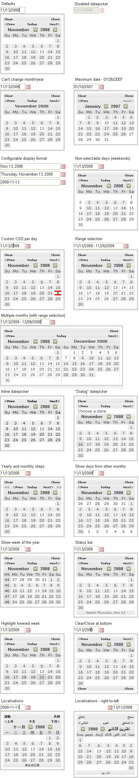
1 - Description:
Datepicker can be attached to a text input or displayed inline on a page, and may contain one or more calendars (months) for choosing a single date. (See the date range widget for choosing multiple dates or a range.)
Datepicker was recently updated to include the functionality outlined below. Please refer to the current documentation: http://jqueryui.com/demos/datepicker
The UI design team has reviewed the new functionality and recommends that a scaled-back version be produced for version 1.6rc3, details below:
Summary of design team recommendations for inclusion in 1.6rc3:
See section 4.2 below for a static coded example of the default picker with new framework styles and recommended options.
- Default to a single, simple calendar with read-only month and year, previous/next arrow icon buttons and click out to close behavior (if in an overlay)
- Configurable default date on first display.
- Configurable display date format.
- Previous and next month navigation are html links under the covers for accessibility reasons, but display as arrow icon buttons with title attributes for visual simplicity and compactness. Using text labels (links) instead of icons should not be supported because it will not fit safely in the layout, esp. if we are supporting multiple languages, however we can use title attributes to clarify their purpose (i.e., Next month). This is what all major desktop and mobile OSs do so it is common convention. Also, the text links should NOT have a carat icon ">" inside them because this is not meaningful for a screen reader and adds clutter.
- Previous and next buttons navigate to the previous and next single month.
- Optional month+year dropdown or separate month and year dropdowns can be added to the top bar in place of the read-only feedback. See examples in mockup below. By default, display read only month and year with previous/next buttons.
- Three picker display options:
- Display the datepicker in an overlay, show on date field focus, via button, or both.
- Display the datepicker inline instead of in an overlay.
- Display the datepicker in a popup "dialog" in the centre of the screen, rather than attached to a specific field.
- Enable/disable the input field and associated datepicker.
- Allow all functionality to be driven via the keyboard.
- Minimum and maximum date restrictions. The script would add the new disabled class to these restricted dates.
- Configurable option to change default first day of the week (could be Sunday or a different day depending on localization).
Features the design team strongly recommends removing from the current plugin / not including in future versions:
NOTE: Questions/comments from the UI design team are marked in bold after each point.
- the clickable day of the week (Mo, Tu) headers to re-sort start day for the calendar. It makes sense for the developer to configure a default start day (Sunday, Monday, etc.) because it may be different depending on localization, however this feature should never be exposed to the end user as it's a non-standard and potentially very confusing interaction, to click a day and have the calendar re-sort.
- "clear" button - seems like overkill since a user can simply clear out the field value manually. Plus, clearing the input would make the input invalid if the field is required. It's best to encourage users to pick a date, not clear the field.
- date range selection (should be part of the date range plugin)
- week hover highlight - hovering over a day to highlight makes sense when that date is selectable, however, it seems confusing to highlight a week when that week is not selectable (that functionality is not covered by the date picker, but by the date range plugin).
- yearly arrow steps
- show a status bar with more information about the various controls/links on the datepicker - this feature seems to just add visual clutter to the UI and the design team would recommend striking it. If we have a clear, uncluttered design, there is no need for a help bar like this.
- show week of the year - unless a strong case can be made for it's inclusion, it seems like an edge case / very specific customization that doesn't need to be included in core functionality
- "can't change month/year" mockup option. (Confused by this mockup because it has what appear to be active < > arrows. Can you explain this feature and why it's needed? Seems like restricting the start and end dates would accomplish this constraint. Can't change via the month/year drop-downs, but can still navigate using the prev/next buttons, i.e. just like the proposed standard layout.)
Proposed features/options for inclusion in future releases:
- Support for showing multiple months (new styles needed from design team). Note: in this mode only the previous/next increment buttons should be shown, never the month/year dropdown, to minimize clutter/confusion.
- When multiple months are supported, an next/previous increment option can be specified (e.g., 2 calendars showing; next/prev buttons move 2 months forward/back). For example, if 3 calendars are displayed, the increment can be set to 3, 2, or 1 (default increment). The increment may be equal to or less than the number of calendars shown, never greater. If the user attempts to set a larger increment, it should default to the number of calendars displayed.
- Specification of default date and minimum and maximum can be absolute or relative to today in any combination of years, months, weeks, or days.
- Show trailing days from previous month; first few days of next month. For example, if Sunday is the first day of each week and December 1 is a Monday, Sunday would show a grayed-back [ 30 ] for November 30. (Separate option to make these dates clickable.)
- Allow for customisation of individual days within each month to indicate whether or not they are selectable and/or to add CSS styling. (We can see this working to show black-out dates, or to provide other feedback (e.g., tickets for a show happening on Friday-Sunday are more expensive than tickets for shows on Monday-Thursday). However we strongly caution against adding the ability to apply unique classes to every date as that would create much markup bloat. Clarify purpose? Maximum flexibility for the user - they have control over the appearance of the days.)
- Support for right>left localization, new styles needed from design team for this.
- Optional button bar can be added to the bottom of the picker only, never at the top, with a "Today" button (left aligned) and a "Done" button (right aligned) or both. For right-to-left localizations, this order would be flipped. The button text can be internationalized as needed (there should be plenty of space).
2 - Visual designs (click to view full size)

Examples using default theme:

3 - Functional Specifications/Requirements:
Options/Methods/Callbacks
Simple datepicker (default)
- options:
- altField (string|element, default: '')
- altFormat (string, default: '')
- appendText (string, default: '')
- beforeShow (function, default: null)
- beforeShowDay (function, default: null)
- buttonImage (string, default: '')
- buttonImageOnly (boolean, default: false)
- buttonText (string, default: '...')
- calculateWeek (function, default: this.iso8601Week)
- changeMonth (boolean, default: false)
- changeYear (boolean, default: false)
- closeText (string, default: 'Done')
- constrainInput (boolean, default: true)
- currentText (string, default: 'Today')
- dateFormat (string, default: 'mm/dd/yy')
- dayNames (string[7], default: ['Sunday', 'Monday', 'Tuesday', 'Wednesday', 'Thursday', 'Friday', 'Saturday'])
- dayNamesMin (string[7], default: ['Su', 'Mo', 'Tu', 'We', 'Th', 'Fr', 'Sa'])
- dayNamesShort (string[7], default: ['Sun', 'Mon', 'Tue', 'Wed', 'Thu', 'Fri', 'Sat'])
- defaultDate (Date|integer|string, default: null)
- duration (string|integer, default: 'normal')
- gotoCurrent (boolean, default: false)
- firstDay (integer, default: 0)
- hideIfNoPrevNext (boolean, default: false)
- isRTL (boolean, default: false)
- maxDate (Date|integer|string, default: null)
- minDate (Date|integer|string, default: null)
- monthNames (string[12], default: ['January', 'February', 'March', 'April', 'May', 'June', 'July', 'August', 'September', 'October', 'November', 'December'])
- monthNamesShort (string[12], default: ['Jan', 'Feb', 'Mar', 'Apr', 'May', 'Jun', 'Jul', 'Aug', 'Sep', 'Oct', 'Nov', 'Dec'])
- navigationAsDateFormat (boolean, false)
- nextText (string, default: 'Next')
- numberOfMonths (integer|integer[2], default: 1)
- prevText (string, default: 'Prev')
- shortYearCutoff (string|integer, default: '+10')
- showAnim (string, default: 'show')
- showButtonPanel (boolean, default: false)
- showCurrentAtPos (integer, default: 0)
- showMonthAfterYear (boolean, default: false)
- showOn (string, default: 'focus')
- showOptions (object, default: {})
- showOtherMonths (boolean, default: false)
- stepBigMonths (integer, default: 12)
- stepMonths (integer, default: 1)
- yearRange (string, default: '-10:+10')
- methods:
- formatDate (parameters: format, date, settings; returns: string)
- iso8601Week (parameters: Date; returns: integer)
- noWeekends (parameters: Date; returns: [boolean, string, string])
- setDefaults (parameters: settings)
- parseDate (parameters: format, string, settings; returns: Date)
- callbacks:
- onChangeMonthYear (events: mouseclick, keydown)
- onClose (events: mouseclick, keydown)
- onSelect (events: mouseclick, keydown)
- commands:
- 'dialog' (parameters: dateText, onSelect, settings, pos)
- 'destroy'
- 'enable'
- 'disable'
- 'isDisabled' (returns: boolean)
- 'option' (parameters: settings or name, value)
- 'refresh'
- 'setDate' (parameters: date, endDate)
- 'getDate' (returns: Date or Date[2])
- 'show'
- 'hide'
- constants:
- ATOM: 'yy-mm-dd' (RFC 3339/ISO 8601)
- COOKIE: 'D, dd M yy'
- ISO_8601: 'yy-mm-dd'
- RFC_822: 'D, d M y'
- RFC_850: 'DD, dd-M-y'
- RFC_1036: 'D, d M y'
- RFC_1123: 'D, d M yy'
- RFC_2822: 'D, d M yy'
- RSS: 'D, d M y' (RFC 822)
- TIMESTAMP: '@'
- W3C: 'yy-mm-dd' (ISO 8601)
Specifications
- datepicker opens depending on the showOn setting: 'focus' for field focus only, 'button' for button trigger only, 'both' for either of these.
- datepicker closes on an external click (outside the field and popup) or when the Done button is clicked
- datepicker appears as a popup when attached to a text input field, or inline when attached to a div or span
- datepicker positions itself below and extending to the right of its input field, unless there is not enough room on the screen there in which case it may move above the field or extend to the left
- when a popup datepicker is disabled both the field and any trigger are disabled, when an inline datepicker is disabled it is covered with a semi-opaque area to prevent interactions and provide visual feedback
- datepicker is keyboard accessible:
- page up/down - previous/next month
- ctrl+page up/down - previous/next year
- ctrl+home - current month or open when closed
- ctrl+left/right - previous/next day
- ctrl+up/down - previous/next week
- enter - accept the selected date
- ctrl+end - close and erase the date
- escape - close the datepicker without selection
- altField setting is either a jQuery selector or the actual element
- altFormat setting is the same construction as dateFormat
- beforeShow is called just prior to the datepicker appearing, and receives the input field and datepicker instance as parameters
- beforeShowDay is called for each date shown on the datepicker, receiving the date as a parameter and returning an array where [0] is a boolean indicating selectability, [1] is a string of CSS styles, [2] is an optional string for a tooltip
- buttonImage is the path to an icon used for triggering the datepicker
- calculateWeek is a function to determine the week of the year, receiving a date as a parameter and returning an integer (1-53)
- constrainInput determines whether keystrokes in the input field are limited to those that conform to the dateFormat
- dateFormat is made up of:
- d - day of the month (no leading zero)
- dd - day of the month (two digit)
- D - day name short
- DD - day name long
- o - day of the year (no leading zeros)
- oo - day of the year (three digits)
- m - month of the year (no leading zero)
- mm - month of the year (two digit)
- M - month name short
- MM - month name long
- y - year (two digit)
- yy - year (four digit)
- @ - Unix timestamp (ms since 01/01/1970)
- '...' - literal text
- '' - single quote
- defaultDate is the date initially selected if no other date has been chosen, being either an actual Date, a number of days from today, a string of units and periods ('D' for days, 'W' for weeks, 'M' for months, or 'Y' for years), or null for today
- duration is the speed of the animation on appearance, either 'slow', 'normal', or 'fast' or the number of milliseconds
- firstDay indicates the first day of the week with 0 = Sunday, 1 = Monday, ..., 6 = Saturday
- hideIfNoPrevNext indicates whether the prev/next links should be hidden rather than disabled when not applicable
- isRTL indicates whether the datepicker should run right-to-left
- minDate and maxDate are the lower and upper limits on the dates that may be selected and may be set as an actual Date, a number of days from today, a string of units and periods ('D' for days, 'W' for weeks, 'M' for months, or 'Y' for years), or null for no restriction
- minDate should be less than maxDate
- navigationAsDateFormat indicates whether the formatDate function should be applied to the prev/next link texts
- numberOfMonths determines how many months are shown at one time, either as a single integer, or a an array with rows and columns (e.g. [2,3])
- shortYearCutoff determines the point at which a two-digit year is deemed to be in the last century, either a string offset from the current year or an integer year (0-99)
- showAnim is the animation used to display the datepicker and may be any of the standard jQuery or jQuery UI show/hide animations
- showOptions allows additional settings to be passed through to jQuery UI animations
- showButtonPanel indicates whether or not the panel of buttons is shown at the bottom of the datepicker
- showCurrentAtPos determines where the current month appears when more than one month is shown, starting at position 0
- showOtherMonths indicates whether dates from other months should be shown preceeding or following the current month
- stepMonths is the number of months moved when the prev/next links are clicked
- yearRange controls which years are shown in the drop-down, either relative to the currently selected year ('-10:+10') or as absolute years ('2000:2010')
- onChangeMonthYear is triggered whenever the month or year changes and receives the year and month (1-12) as parameters
- onClose is triggered when the datepicker is closed, even if no new selection has been made, and receives the current selection as a string as a parameter
- onSelect is triggered when a new date is selected, and receives the current selection as a string as a parameter
- iso8601Week returns the week of the year according to the ISO 8601 definition - weeks start on a Monday, the first week of the year contains the first Thursday of the year
- formatDate and parseDate operate on the same formats as dateFormat
Changes from 1.5, 1.6rc2 in refactor
-
removed options:
- clearStatus
- clearText
- closeAtTop
- closeStatus
- currentStatus
- dateStatus
- dayStatus
- highlightWeek
- initStatus
- mandatory
- monthStatus
- nextBigStatus
- nextBigText
- nextStatus
- prevBigStatus
- prevBigText
- prevStatus
- rangeSelect
- rangeSeparator
- showBigPrevNext
- showStatus
- showWeeks
- statusForDate
- weekHeader
- weekStatus
- yearStatus
- modified options:
- changeMonth to default false - was true
- changeYear to default false - was true
- added options:
- showButtonPanel (default false)
Still to implement in refactor
4 - Markup & Style:
4.1 Initial markup examples
4.2 Recommended transformed HTML markup demo with html and css (live view of svn):
Examples in order of appearance:
default picker, single month + year dropdown option, separate month and year dropdowns option, optional button bar
View Demo Page: http://jquery-ui.googlecode.com/svn/trunk/tests/static/datepicker/datepicker.html
4.3 Markup & style browser QA status
As of 12/12/08, static markup for this widget renders correctly in the following browsers. (Correct rendering = true to design, with only small differences across browsers owing to differences in support of rounded corners, and native OS form element and font rendering.)
Please update this list as more browsers / platforms are tested.
| |
XP |
Vista |
Mac 10.5 |
IE 6
|
|
|
|
| IE 7 |
|
|
|
| IE 8 beta |
|
|
|
| Firefox 2.0.0.18 |
|
|
|
| Firefox 3.0.4 |
|
|
|
| Safari 3.2 |
|
|
|
Opera 9.1
|
|
|
|
Opera 9.62
|
|
|
|
| Chrome 1.0 |
|
|
|
4.4 Accessibility recommendation
http://jquery-ui.googlecode.com/svn/trunk/demos/index.html
This page works fine I think. I see a list of links, interspersed with text (Interactions, Widgets, and Effects). I'd recommend using headings and simple unnumbered lists instead of the dl here, but not a big deal.
http://jquery-ui.googlecode.com/svn/trunk/demos/datepicker/default.html
OK, the instructions at the end of this page say:
"This is a default datepicker which is tied to a standard form input. The calendar opens in a small overlay onFocus and closes automatically onBlur if a date if selected."
That should read "... date is selected."
Aside from the typo, this says that the control is completely unusable for a screen reader user. If I'm focused on the input control (a standard textbox), then by definition I can't read or interact with the calendar. This isn't strictly true, (see below)...
Screen readers have two modes for interacting with web browsers: jaws calls them "forms mode" and "virtual mode". This because the screen reader takes a snapshot of the page when it is loaded and presents it to the user. In virtual mode, all keystrokes are captured by the screen reader and used to manipulate/interact with the virtual view of the page. So, in this model, your date picker is fine because I can arrow to the form control in the virtual mode, press enter to enter "forms mode" (which turns off the virtual buffered mode and allows the user to interact directly with the browser). This focuses the control; tabbing to it also focuses the control. Now I have to go and find the calendar and click on a number in the calendar table. Now I can go back to the input field and see the date entered for me.
However, having two modes like this can be confusing, especially to novice or nontechnical users. ALso, nonwindows screen readers (Orca on linux and VoiceOver on Mac) do not use two modes; all interaction is with the browser and the access technology simply reacts to the focus and tries to speak what's rellevant. This means that we only have one point of regard at any given time -- the focused element. Using Orca for instance, arrowing t down till we reach the input field and tabbing to it both produce a focus change event and the calendar appears. However, if we then try and find it and interact with it, we must move fucus and thus the calendar disappears.
To elleviate this situation, you might add keyboard commands to move through the calendar :
control right/left arrow : select next/previous date in the calendar and put it in the input field;
control up/down arrow : move to next/previous month.
* Calendar Table
I can't see the source of the table because I don't have good access to a document inspector, but I suspect the column headings are not marked up using th because when moving across the row with the screen reader's table reading commands, I do not hear the headings of the columns spoken as I move from one column to the next. This should happen if the table is marked up properly. The scope attribute is not needed; just be sure to mark up the column headers with th instead of td.
http://jquery-ui.googlecode.com/svn/trunk/demos/datepicker/dropdown_month_year.html
Here's an interesting problem: if I focus the input field, then arrow down to the select list for month and try and interact with it, my focus gets moved back to the date field.
This suggests another possible interaction mode: currently if focus moves away from the input field then the date picker disappears. Perhaps this rule should be amended. As long as either the input field is focused, or any other part of the date picker widgit is focused (the calendar itself, or more likely the month/year select lists since this is probably what most screen reader users will find easier to use), then the date picker stays opened. Then, when the date picker is initially opened, have focus automatically jump to the month select list if this option is used, or to the calendar table itself if the month/year select lists are not turned on.
Does this make sense?
http://jquery-ui.googlecode.com/svn/trunk/demos/datepicker/icon_trigger.html
This is nice because it gets around the issue discussed above. Guess I should have looked at this one first <smile>...
The image which should be clicked to bring up the date picker should have alt text -- "select date" or some such.
http://jquery-ui.googlecode.com/svn/trunk/demos/datepicker/inline.html
This brings up another point: there should be some sort of option to add an introductory heading which introduces the date picker.
In this specific case, you might also want to make the text "date:" (which labeled the input field in the other demos) a label for the entire date picker (I think the attribute is aria-labelfor or some such). You could then make the calendar focusable by setting its tabIndex (I'd suggest 0 since it would be nice if the calendar were in the tab order in this case ).
http://jquery-ui.googlecode.com/svn/trunk/demos/datepicker/min_max.html
How is the valid date range shown? It appears as though all the visible dates (i.e. entire month) are selectable; only the dates which are selectable should be clickable items.
4.5 CSS & Theme
See html styles in the demo page iframe above for latest svn version.
5 - Related jQuery Plugin:
https://www.opensourcery.com/blog/alex-kroman/better-date-picker
6 - Open Issues
See section 1 for list of questions.
DatePickerCalendar
|
|
Tip: To turn text into a link, highlight the text, then click on a page or file from the list above.
|
|
|
|
|

Comments (24)
Todd Parker said
at 1:06 pm on Dec 9, 2008
Hi all - We've taken a pass through all the features and woudl like to recommend that we simplify the default calendar and pare down some of the less frequently used options. I've made comments in bold next to each feature with questions or recommendations and summarized the design team's recommendations for the date picker below that area. Scott also has added examples of the new date picker styles embedded in section 4.2: default, month & year dropdowns, and button bar. We still need to produce static mockups for the multiple calendar and right>left localization options.
Maggie Wachs said
at 5:12 pm on Dec 10, 2008
Following on Todd's comment:
We reviewed the list of options a second time, removed redundancies and divided them into three categories:
- recommended for inclusion in the next release
- recommended for removal from current code / not to be included in future release (unless a very strong case can be made for keeping them in -- most seem to be non-standard interactions or edge cases)
- proposed for a future release.
Scott has created a number of static mock-ups already (http://jquery-ui.googlecode.com/svn/trunk/tests/static/datepicker.html), however before we continue building out the markup variations we think it makes sense to get consensus on which of the many options listed above will be included in/pared back from the next release. Please weigh in.
Marc Grabanski said
at 2:42 am on Dec 12, 2008
The feature list looks great! Ooo... now this looks like fun to develop.
Anonymous said
at 10:43 am on Dec 18, 2008
What about support for alternate calendar systems (distinct from UI language and direction)? All calendar systems in use today are made up of days, weeks, months and years. The variations would be as follows:
- algorithm for structure of a given month
- default first day of week
- month/weekday labels
- year name/textual representation
In order to draw a given month, a calendar system's algorithm for a given month should return the following:
- first/last day of month
- number of days in month
- next/previous month/year (for clicking on the next/previous navigation)
kpitn said
at 1:50 pm on Dec 21, 2008
Just because, they are not a lot of work to do with this "plugin" , i have another suggestion :
I need for a past project, to let the user choose, the date and the hour of an event.
Two persons works on a patch to a previous version of jquery ui to do this :
http://dev.jquery.com/ticket/2566
http://www.derekallard.com/blog/post/adding-time-to-jquery-ui-datepicker/
Morten said
at 4:57 pm on Feb 15, 2009
"show week of the year - unless a strong case can be made for it's inclusion, it seems like an edge case / very specific customization that doesn't need to be included in core functionality"
The use of week numbers is highly cultural. Sweden for example use weeknumbers alot during planing activities. Id recommend keeping the showWeek option.
Todd Parker said
at 12:34 pm on Feb 23, 2009
Jorn had a suggestion for a large agenda view which is essentially a large calendar control that usually lets you view and add events within a day. Example: http://www.bytecyclist.com/SourceCode/jMonthCalendar/1.0.1/Index.html#
There is a mockup of an agenda view in the design section. This may make sense as a separate plugin that leverages the calendar picker code for a lot of the logic but adds specific functionality need for an agenda like views (year, month, week, day) displaying events in days (or across multiple days), etc.
This suggestions was posted ot the homepage, but I think it makes sens eot leave it here for now until this is broken up into separate pages for the various date, range and agenda plugins.
Andrew Powell said
at 1:32 pm on Mar 11, 2009
From a thread I started on the UI Dev Group (which led to my signup here, http://groups.google.com/group/jquery-ui-dev/browse_thread/thread/5fa9426236a61372)
I would like to propose some additions to the Datepicker included in the latest stable version (1.7).
- Option allowing the current date to be selected, and the Datepicker closed when 'today' is clicked.
We're currently using a custom rolled solution very similar to the one included with jQ.ui. This is a functionality that the users of this control have become very used to using. At present, the 'Today' button does nothing more than take you back to the month/year of the current date. It doesnt select it, nor does it close the dialog. Many calendar/datepicker scripts available on the net today follow the
ideaology of selecting the current day and either closing the dialog or allowing the user to close the dialog.
- Option/Change for rendering the month and year select elements as div/ul-li
When our custom script was first put together, we chose to go with the easy to use <select> element for this purpose. However, we chose to go with a ul/li solution as it was both compact, and allowed us to style our custom dropdowns in order to make it appear identical on each browser. (IE6,7, Opera, Safari, Chrome and Firefox render comboboxes/dropdowns much differently). The same css proposed for the Menu plugin could be used here to avoid breakage.
I'm going to have to implement these features for my needs anyhow. So if either one of these are welcome additions I'll implement them and see about getting changes reviewed. Please share your thoughts.
Steven Black said
at 8:57 am on Mar 14, 2009
I just added, in red, the following snippet to the spec about datepicker opening: "suggestion for next release.... and 'none' to disable datepicker opening"
I hope that is OK.
Here is my use case:
* A medical records application that supports theming.
* Unfortunately jQuery-UI has very pale ui-state-disabled CSS classes, such that in many applications, it is too pale to be read.
* I have opted to swallow keyDown and mouseDown events on disabled fields to prevent input
* BUT there is apparently no way to stop the datepicker from opening!!
That's a real hole in the spec when you think about it.
Andrew Powell said
at 9:49 am on Mar 14, 2009
Perhaps we should be checking the disabled state of an input prior to displaying, instead?
Steven Black said
at 10:14 am on Mar 14, 2009
Actually, when the disabled attribute is there, it works fine -- bo datepicker dialog appears.
The use-case here is a medical records application where input fields are, for the most part, viewed in a disabled state and the ThemeRoller ui-state-disabled CSS classes are really low-contrast.
We've chosen to keep the contrast consistent and readable, but only accept input after the user hits an Edit button.
All is well except the datepicker evidently wires its own click bindings. We need a way to programmatically tell the datepicker not to respond. Something like this:
$('.selector').datepicker('option', 'showOn', 'none');
Scott González said
at 10:35 am on Mar 14, 2009
Steven, why not just disable the datepicker? That seems much more intuitive than changing the showOn option.
Scott González said
at 10:40 am on Mar 14, 2009
This sounds like a purely visual issue, so the answer should be CSS not JavaScript.
Andrew Powell said
at 10:58 am on Mar 14, 2009
@ Steven Black : I think a test case/demo is going to be needed to fully convey the situation in which you're trying to describe.
@ Scott : I'm not convinced that he's describing a pure css issue. I'm reading it as him wanting to have the option of creating a datepicker and wanting to control how and when it's shown; preventing the plugin from hooking up it's own bindings to the target element.
Steven Black said
at 11:06 am on Mar 14, 2009
@Scott: / why not just disable the datepicker? // That would work <s>. Now how did I miss that method? Duh, nevermind.
@Scott: / CSS issue // With Themeroller, specifically on-the-fly theme switching (which is very cool and very valuable for sales and demos etc) we havn't really got alll the CSS-control we'd probably like.
Steven Black said
at 11:08 am on Mar 14, 2009
( I just removed my suggestion form the wiki page. Does PB Wiki not have change comments upon edit submit? )
Todd Parker said
at 11:35 am on Mar 14, 2009
Re: the disabled state being too low contrast. To maintain themability and not requir a whole set of levers for disabled, we decided to simply set the opacity to something low like 30% as a reasonable compromise. You can easily adjust the disabled appearance by writing a rule override for ui-state-disabled tohave more opacity or adjust colors, borders, etc. To get the desired style.
Jörn Zaefferer said
at 7:15 am on Mar 15, 2009
The option showMonthAfterYear is listed here, but isn't documented. The regionalization demo always sets it to false, which is the default anyway. When combined with changeYear: true and changeMonth: true, the layout breaks.
Jörn Zaefferer said
at 7:35 am on Mar 15, 2009
The buttonImageOnly option seems to be an excuse for not properly styling the button element. Adding ui-helper-reset and ui-state-default would be a good start, applying the image is a background-image the next step. Or we remove the option and make it a default.
Bart Deslagmulder said
at 2:45 am on Apr 1, 2009
Hi,
I'm developing a form where I use this DatePicker. It works great! But I noticed the following:
1) click in input field -> DatePicker shows up
2) enter a date; for example: 26/04/1988 -> Hit Return (keyCode 13)
=> Result: my input is overwritten with today's date.
My suggestion: a Boolean to set keyboard functionality to false / true (with default: true) or just that it ignores the action to replace an input with today's date so it will close the DatePicker and won't change my input.
What do you think?
And once more, GREAT work all!
Sunny greetings from Belgium.
Bart Deslagmulder
Andrew Powell said
at 1:52 pm on Apr 7, 2009
+1 @ Bart's suggestion.
Also, (and please point this out if I'm missing it) there seems to be no option/functionality to instruct the plugin to highlight the currently selected day. If the month/year changes in the targeted input, the calendar will compensate, but the current day selected is not reflected in the calendar popup. Intended? Bug? I'm blind? Please comment.
Andrew Powell said
at 1:53 pm on Apr 7, 2009
Forgot one note:
The constrainInput option doesnt really seem to work. For the default format, it doesnt really constrain the targeted input's keyboard input to the format specified, but rather just prevents non-numerics. It's still be worked on, and is pending review by the team, but using the mask widget for this seems like an ideal fit.
Andrew Powell said
at 1:59 pm on Apr 7, 2009
Oh how I wish that the pbwiki had an edit button. Sorry about the multiple posts all.
Regarding the not showing of the currently selected day; As soon as I added the following options, the selected day was appearing 'selected' in the calendar. Not sure if this is a bug or intended. But I wanted to post here in case anyone else ran across it.
changeMonth: true,
changeYear: true,
showButtonPanel: true
Leomar Uztariz said
at 9:47 pm on Apr 14, 2009
Hi guys I just have a comment, I was trying to use the "Clear" button and noticed it was excluded from the component, I don´t think it's an "overkill" feature because as you can see here: http://blog.unthunk.com/2009/02/09/put-the-clear-button-back-in-datepicker/ it would be very helpful to have this funcionality back into the datepicker, many people (not only me) are requiring it... are any chances to bring this back in the next release? is any way one can do that by our own?
You don't have permission to comment on this page.